Landing pages are all the rage these days. 😉 Soooooo trendiiiiiing (said with SoCal Valley Girl accent).
And for great reason!
This article’s purpose is to give you an overview (plus specifics!) on how to create and optimize your landing pages for more email opt-in conversions and sales. I’ll look most specifically at landing pages that give away a lead magnet with the goal of list building.
And I’ll look most specifically at landing pages that give away a lead magnet with the goal of list building.
Here‘s an outline of what we’ll cover:
Part 1: What Are Landing Pages? And how can we build them?
- Landing Pages (defined generally)
- 3 Types of Landing Pages (defined specifically)
- Click-Through Landing Pages
- Lead Capture Landing Pages
- Sales Page Landing Pages
- 6 Tools to Build Landing Pages
- Q & A advice for building landing pages
- Who is your target audience?
- What is the audience’s problem, pain point, or deep motivation?
- What essential info needs to be communicated about your offer?
- Final tip
Part 2: Optimizing Landing Pages
- 3 Landing Page Optimization Basics
- Optimize for what?
- Visuals (colors, fonts, images)
- Spacing (how does layout make you FEEL?)
- 3 Landing Page Optimization Advanced Tips
- Headlines
- The 5-Second Rule
- A/B Split Testing
Let’s get started!
Before I describe the tools you can use to create landing pages and the tips you can use to optimize them, let’s set out a few definitions so we are all clear and on the same page.
Page! Get it? Landing page…page… okay, let’s go. 🙂
Part 1: What Are Landing Pages? And how can we build them?
Landing Page Defined (Generally)
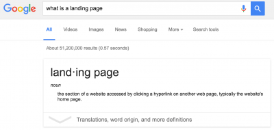
If you were to Google “landing page” right now at the time of this writing, you would find:
“The section of a website accessed by clicking a hyperlink on another web page, typically the website’s home page.”
Okay, that sort of covers it.
Essentially, a landing page is any page online where one can land (or visit) coming from somewhere else. This could be coming from another page on the website – like the homepage – or it could be from an outside source – like a Facebook ad, a guest blog post, or an Instagram profile bio.
But I would argue (strongly) that a good landing page is not your homepage itself. We’ll get into why in a second.
Landing Page Defined (More Specifically)
Drilling down a bit more targeted for our purposes as entrepreneurs (and marketers), there are three types of landing pages that I will lay out for us here.
- Click-Through Landing Pages
- Lead Capture Landing Pages
- Sales Page Landing Pages
1. Click-Through Landing Pages
A landing page with the sole purpose of warming up the traffic a bit before sending them on to the next page can be called a “click-through landing page.”
For example, maybe you sell t-shirts and decide to run a Facebook ad.
But the audience you are targeting with your FB ad doesn’t know you or your brand yet (a “cold” audience), so you decide to drive them to a landing page that has a bunch of fab photos of models rocking your T’s and a bit of a background on your company and mission.
The goal is to ‘warm them up’ and get them to know you a bit before going for an ‘ask.’
But also on the page, you place clear calls to action (CTAs) next to the products for sale and entice the visitor to click deeper into your site and ultimately make a purchase. Maybe there is even a one-time coupon code they can use when they check out to motivation clicking further too.
Now let’s touch back on what I said before that your homepage is *not* the ideal page for a click-through landing page… or the other two types either!
Why not?
Most homepages are cluttered with menu tabs, subscription forms, internal links, buttons, and more. A smart rule of thumb (that we will cover in optimization later in this article) is to have ONE main goal for each landing page.
[An exception to this could be as above when you are selling multiple products on a shop page. But even then, the products should be highly focused and relevant to the traffic you are driving to the page. The more options, the less action.]
How many CTAs do you spot in this homepage?
(I drew in the pink arrows to where I found something…)
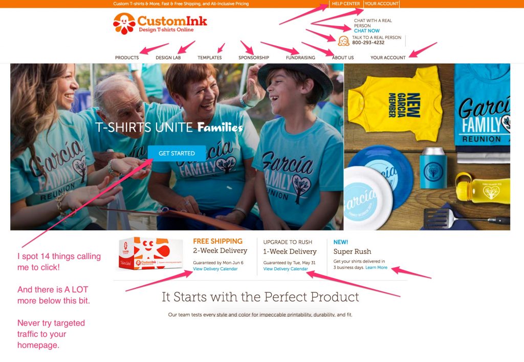
I counted 14 different actionable items above the fold (without scrolling) on this homepage above. And it scrolled a lot further too, so likely over 30 different actions that could be taken by a new visitor!
That’s too many to send traffic to if you have a goal (and you should have a goal) with your traffic-driving marketing efforts.
So remember, 99% of the time, homepages don’t make great landing pages.
2. Lead Capture Landing Pages
The purpose of this type of landing page is to …drum roll please!… capture leads.
A visitor will land on one of these pages and will be propositioned with an irresistible offer that can be had for the low low price of their email address.
This irresistible offer is called a “lead magnet” and is usually a checklist, quick how-to guide, video tutorial, template, or other ‘quick win’ that will help your audience with their pain point without overwhelming them.
A core component of any email list building / email marketing strategy.
From my experience and research, lead capture landing pages are best when short and ultra-specific.
You want to give just enough information so the visitor will know what you are offering in exchange for their email AND so the visitor will be enticed by the offer’s value.
But you do not want to give more information than needed because that will:
- overwhelm the visitor
- distract the visitor
- confuse the visitor
- bore the visitor
The internet is full of funny and flashy objects. You don’t have much time to capture attention and convince people that what you are saying is click and email-trade-worthy.
So cut to the chase and make it clear!
This is where powerful visuals and killer copy comes into play.
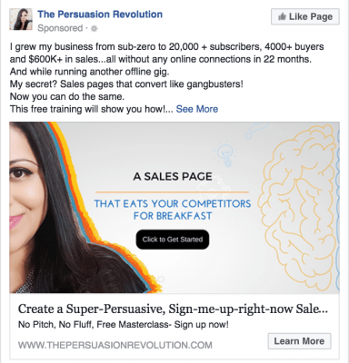
Here’s an example from The Persuasion Revolution.
Facebook Ad (Leading to the Landing Page):
Landing Page:
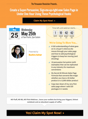
This one, in particular, was driving people to sign up for a free webinar for creating a persuasive sales page using psychological hacks. Sign me up!
What I like about her approach here is:
- consistent colors from ad to landing page (black and orange)
- great copy that makes me want to click and see what she is giving away, then sign up for the webinar (including results-oriented numbers)
- personal touch with real photos of her
- only one call to action (in other words, just one goal on the page)
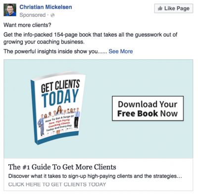
Here’s another example from Christian Mickelson…
Facebook Ad (Leading to the Landing Page):
Landing Page:

What I like about his approach here is:
- consistent colors from ad to landing page (light teal blue)
- clean copy that makes it crystal clear what I will get if I take the offer
- the photo is of the actual book I will get (digitally)
- background of the landing page makes me think about financial freedom which is in line with the target audience who are business builders
- only one call to action (in other words, just one goal on the page)
3. Sales Landing Pages
A sales landing page is where you are making your pitch to get your audience to hand over hard-earned money for your product or service.
These tend to be a bit longer.
How long?
The rule is… as long as it needs to be. Again, without confusing or boring the viewer.
And in general, the higher priced the item is, the longer the page needs to be to really show off the benefits the purchaser will receive if they click “Buy Now.”
Here below is the first step of a sales page for the Screw the Nine to Five’s “Screw U” membership.
If you aren’t familiar with them, they have a playful, tongue-in-cheek, irreverent tone that is NOT for everyone. And boy, is that a good thing. The people who do connect with them, REALLY connect with them. [Another pro copywriting and branding tactic.]
Check out their sales page below for an example of awesome copy, visuals, and layout. I’ve added my thoughts in pink on the screen capture of their sales page.
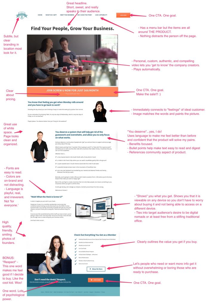
As you can see above, there are tons of great elements to their sales landing page. Some of the key takeaways are:
- 1 CTA. 1 goal.
- There isn’t anything to click on besides buttons that get the person to buy now OR learn a bit more so they can buy now. Brilliant.
- Fonts are clear and easy to read.
- on-brand colors
- sans-serif font (it’s easier to read when letters don’t have ‘tails’)
- Smart use of bullets, sectioning, bolding, and different header sizes
- but without too much variation to cause visual confusion
- Immediate and strong connection TO target market and WITH creators of the company.
I don’t have a single critique of this sucker. Me likey!
Tools to Build Landing Pages
Good news / Bad news
Which do you want first?
The good news is there are lots of different platforms and tools out there to build great looking landing pages!
The bad news is… well, there are lots of different platforms and tools out there to build great looking landing pages so it’s hard to pick one and then once you do, you run into issues integrating things with other systems….
Long story short, there is a learning curve with ANY creation tool you select.
And some platforms are more easily integrated with other tools than others. For example, when I used ConvertKit for email marketing, there was an extra step involving finding a snippet of code to get it to link up with my LeadPages landing pages. Whereas that extra step was not there when linking LeadPages with Infusionsoft or Aweber.
That’s not necessarily a deal breaker, but it’s good to be aware that little quirks do arise.
If you want advice based on YOUR tools, please ask in the comments section below and I will do my best to help! 🙂
For now, I will list out six landing page building tools I know of and put a note by the ones I have personal experience with, plus add a bit of commentary at the end.
Note also that:
Infusionsoft (IS) has integrated landing pages into their recent roll outs. Although I use them for email marketing and my CRM, I have not used their landing pages (my gut says they are not robust enough yet — but worth a try if you are already using IS or plan to — maybe you can save money and not have to buy a separate product for landing pages).
From my experience with LeadPages (LP) and Click Funnels (CF), LP is easier to get started with and cheaper than CF. But CF is more robust in setting up sales funnels too and taking payment integrated into the platform.
Here are two examples of landing pages from my own businesses.
The one on the left is longer and is a Lead Capture and the one on the right is shorter but also a Lead Capture landing page.
On the “thank you page” (or the page the comes next) for both of these we pitch a Trip Wire or Intro. Offer. That is a low-cost item of high value to get the lead to turn into a customer and start getting used to seeing us as sources of lots of value. [This is a whole other blog post!]
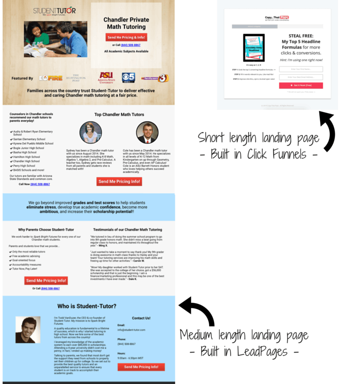
I recommend both LeadPages and Click Funnels and will be writing more detailed posts on each in the future along with video tutorials, so look out for those on the website here.
Personally, I have never used Thrive but a lot of people in my entrepreneurial groups in Facebook use and recommend them. And with Thrive, you can pay a fairly low one-time fee and will be off and running versus the monthly fee with most of the others listed.
Okay, so we have talked about #1, #4, #5 on the list. How about the others?
#2 Hubspot: I have used for social media scheduling for a client I used to manage, but not for landing pages.
#3 Instapage: I have no experience with but heard good things.
#6 Unbounce: I have not used but love one of the founders, Oli Gardner and regularly read the great articles the company puts out on landing pages and digital marketing.
So, #2, #3, and #6 I have also not tried, but I have heard about them from friends and colleagues, so I added them to the list to give you more of a variety in your research of the best option for you.
Quick Pause for Q&A

A wonderful new biz buddy of mine posted this question on a post I made inside a Facebook group sharing that this blog was about to be written.
And it is a great question!
1st: Tips to build landing pages.
I would say start in the section above with finding the right techie tool to build them.
Which you should choose depends on how much coding you know, your budget, your preference, and what other systems and platforms you are already using.
So ‘how to build them’ can only be answered once we know what tool one is using. I personally use LeadPages (for quick lead capture items on my blog) and Click Funnels (for more robust funnels where I am trying to convert a new subscriber to make a purchase on the ‘Thank You Page’ as I alluded to earlier.)
If you Sya – or anyone else – wants advice based on the platform you use, comment below and I can help drum up resources for you!
I can also do a more in-depth tutorial post on building a page in LeadPages and Click Funnels so you can see it in action! Just let me know what you want to know so I know what to focus my efforts on. 🙂 I’m a teacher, so I love making tutorials and explainer materials. #nerdalert
2nd: How to choose the right contents to get people to opt-in.
That is a great question.
Here are a few necessities where we all have to start:
1. Who is your target audience?
Trust me, I HATE that we always have to start here and go back to it, but it’s so true. Before you can do anything successfully, you have to really understand your target audience, or it’s just guessing and crossing our fingers.
If you sell charm bracelets, for example, even that is not niched down enough. How you would speak in selling bracelets to 17 year-olds is completely different than how you would speak to moms with newborns or grannies with grandkids.
2. What is the audience’s problem? Or pain point? Or deep motivation?
Back to selling bracelets, what makes people really WANT to buy a bracelet?
– Is it to “look cool like all their friends who have them too”?
[Pain: don’t want to look lame or poor or unpopular]
– Is it to “capture memories and hold on to a feeling”?
[Pain: don’t want to let go of that special feeling or time in life]
– Is it to “give grandma the feeling of pride that her grandkids gave her something thoughtful and now she can show it off to all her friends at church or Bunco”?
[Pain: don’t want to feel forgotten]
PS: Bunco is a dice game my grandma used to play regularly with her lady crew. #squadgoals
3. What is essential information to be communicated about your offer?
To entice someone to want to trade their email for a freebie to opt-in to your lead magnet, you have to clearly state (and show with visuals is ideal too) what they will actually get.
Then you have to choose your language well so that it feel irresistible.
The exact combination of words will also depend on your target market and their desires.
– If I am writing for teens, I might say,
“Snatch up this FREE bracelet-making guide and be the envy of your girlfriends!”
– If I am writing for grandmothers, I might say,
“Receive a clear, step-by-step guide to easily make lovely bracelets for yourself and your grandkids that you will all treasure [free].”
It takes some practice and also market research to refine your messaging and get it right. But once you do, it’s amazing the results.
4. Final tip
What are things your audience or current clients ask you about often?
Keep a swipe file (a.k.a. Evernote or Google Drive Doc list) with questions that your audience has. An F.A.Q. list, if you will.
This will start to reveal what they want, the words they use, and how to best communicate to them so you can show that you can help them avoid pain or receive more happiness.
Two other comments (above) that I got — and wanted to highlight from amazing biz buddies AND podcast episode guests Minling and Charlotte — had to do with landing page optimization.
Another great topic!
It is something we all can improve on.
So let’s answer these questions by diving into the next section!
Part 2: Optimizing Landing Pages
Landing Page Optimization (The Basics)
Alright, so if you have read everything in this post thus far, you are probably picking up some insights already in how to optimize your landing page.
But let’s also address a question you may have by now…
“What do we want to optimize for?”
1. Optimize for what?
There are many ways you can optimize your landing pages online… here are a few of the biggies…
- for SEO (search engine optimization: getting ranked higher in Google and Bing, assuming anyone uses Bing)
- for user experience (“UX”: ease and enjoyableness of use by the visitor)
- for conversions (getting clicks to the next step – the page’s goal)
Sometimes optimizing for one of the above comes at the expense of another. For example, if you optimize for SEO in your blog title it may not be as enticing to click on as if you optimize the title for conversions.
To illustrate:
“The One Thing Successful Entrepreneurs Aren’t Sharing – And It’s Costing You Money” is optimized for conversions. It piques curiosity and appeals to a person’s self-interest to want to KNOW what am I not being told!?
But if the article they open is about landing pages, then the title is missing that keyword and won’t get as much Google-juice as a result (though there are many factors that go into ranking).
This is not to say that hitting all three optimization types is impossible.
But it does take some practice and testing! 🙂
For the purposes of this article, let’s focus on goal #3: conversions… while still keeping SEO and UX in the back of our mind so we don’t wander down the “click bait” rabbit hole.
[“Brad Pitt Flashes Reporters – Shocking Pictures Caught on Film” and the article is about Brad turning a flashlight on and off in a store. This title would get a lot of clicks, but the content doesn’t really live up to expectations.]If our NUMBER ONE… well, I should say SINGLE goal… is to improve our landing pages for more conversions (without being sleazy about it), then let’s have a look at some basics we need to make sure we watch out for.
1. Visuals (colors, fonts, images)
These need to hit a few targets.
A. Colors, fonts, and images need to match the look and feel of what drove the traffic to them in the first place.
If your visitors are coming from another page on your website, a Facebook ad, a social media post, a guest blog, whatever… no matter where people are coming from, there need to be some visual ‘anchors’ or tie-ins that let the visitor know immediately that they landed on the right place.
This can be accomplished by making sure your logo is visual (in the same spot from page to page is ideal) and by using similar (or identical!) colors, fonts, and images from the step prior.
A tip for making sure you always use the same colors is to write down the hex code for the colors of your brand.
If you aren’t sure what your color codes are you can check out a site like HTML Color Codes and upload your logo or any image.
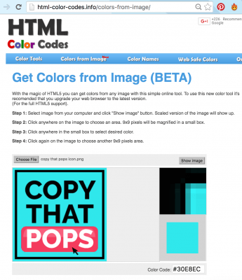
Now, as in the example above I can take the code #30E8EC and use it in other programs to make sure all my materials are identically colored.
Here I entered it into the color tool in Canva to make it match my brand teal blue.
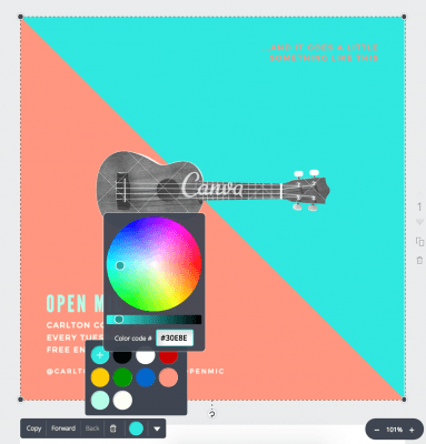
Then here in Click Funnels, I can change the background or other parts of the page to match my exact colors.
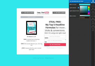
It’s a bit of a pain to write down and remember that exact code, but if you do, your stuff will look cleaner, more aligned, and go a long way toward improving your conversion goal.
One last tip, I saved my hex codes in a text file (.rtf) on my computer so anytime I need them I hit Command + Spacebar (on a Mac) and type in “hex code” and mine pops right up there in the search.
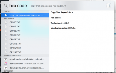 Saves me gobs of time.
B. Images need to make no-brainer sense for being there.
Remember the image of the girl with her head in her hands on Screw U’s sales page? That was lined up with the section about “feeling dread for another Monday morning.” a.k.a. ‘A case of the Mondays.’ haha, but don’t quote me on that phrase.

It would have been LESS effective if they had an image of a calendar with Monday circled.
While that is relevant and not completely terrible, people connect with other people. And tapping into emotion is ideal for encouraging people to take action.
So use authentic, emotion-laden, relevant photos to improve your message and connect with your visitors.
This will undoubtedly help your landing page conversions.
Where can I find good photos?
- One of my favorite free stockphoto websites that doesn’t require attribution is Pixabay.
- If you want a list of 61 sites in total (that are free + no attribution), check out this blog I wrote on another website. I’m obsessed with free stockphotos.
- If you have a budget, check out BigStockPhoto.com. Their stuff is terrific and there is a free 7-day trial.
C. Fonts need to be clean and clear.
ANYTHING that is even slightly odd, out of place, or different for-no-clear-reason will confuse your visitor. You have about 3 seconds or less to make a good and clear first impression.
If your fonts are crazy colors and there are a bunch of different styles and sizes you are taking up precious bandwidth from the reader and increasing their chance of bouncing.
I personally use ONE sans-serif font and ONE cursive font for all of my branded materials.
For example in this image below, “Make your … count” is in Open Sans Bold and “3 Seconds” is Shadows Into Light font. (Created in Canva).

On a landing page, I just stick to the sans-serif font and mix up some heading sizes and occasional bold and italic for flavoring. My font is ALWAYS the same color. Usually black or a very dark gray.
If I use a color for font it is usually for hyperlinks and then I use my brand’s pink color.
Keep that point in mind as well. If you want people to actually click on links you embed, they won’t even notice them if your fonts are a ton of different colors.
Don’t distract people from taking the next action.
2. Spacing
With spacing, I mean essentially the layout of the elements on the page.
- How close together are things to one another?
- Are there lots of blocks of text that feel arduous to read? (not good)
- Do words run right up to the edges of the containers they are in? (not good)
I think we all have the natural tendency to brain-dump everyone we want to tell a prospect, and we have a hard time editing or cutting out stuff that actually isn’t helping conversions.
But visitors are busy and if things feel cluttered or disjointed, they will not stick around to sort it out.
They will move on to a cat video instead. Meow.
Therefore, your use of ‘white space’ is important. Leave room to let things breathe… but not so much space that people think, “Was this giant gap intentional or am I missing something??”
This takes a bit of practice, but a great exercise to get better with it is to set aside 15 or 20 minutes and go visit your favorite websites. That could be Tom’s Shoes or Calvin Klein or Pat Flynn’s Smart Passive Income. It doesn’t matter the genre.
But don’t get distracted and start shopping.
Instead, take note of how YOU FEEL instantly when the page loads.
For example, here’s my Amazon home page:
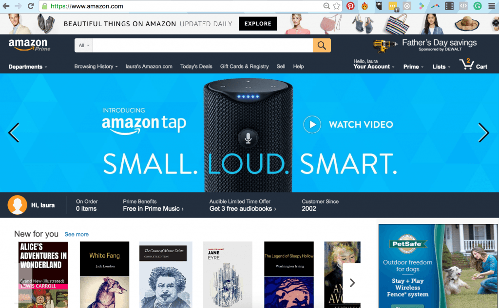
How do you FEEL when you first see this?
I feel overwhelmed. Not so much that I hate it and won’t use it… but it’s not a place that makes me feel focused and calm.
Unless I know exactly what I want, I never go there at all.
Contrast that with this from LeadPages:
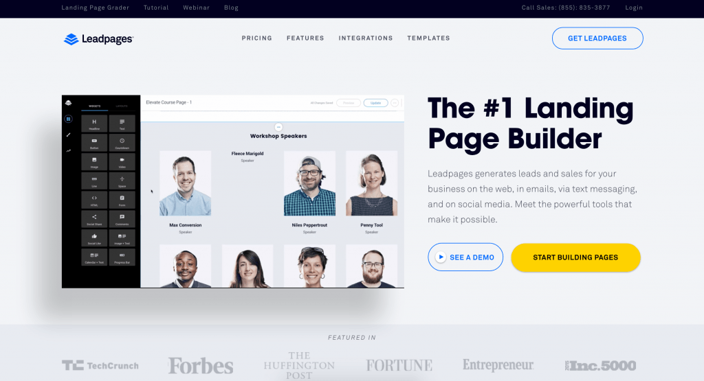
How do you FEEL when you look at this page?
I feel more calm and confident that I will find what I need (assuming I care about landing pages).
Notice their use of “white space” is significantly more than Amazon. There’s more padding around elements so things have some separation from each other. To me, this communicates that I can trust them to provide me with what I need. The social proof of the “Featured In” bar helps with that too.
Your turn:
Explore some other websites of your own and just take note of how you feel and what in the layout of the page is contributing to that feel.
Being in touch with this – just noticing it – will help you with your own design.
Landing Page Optimization (Advanced)
1. Headlines
We have to put headlines at the top of this list because research shows that about 80% of people ONLY read your headlines. And with less than 3 seconds to make a good first impression online and entice someone to want to stay longer and read further, your main shot lies with the headline.
Read this article with more in-depth tips for headline crafting!
2. The 5-Second Rule
Raise your hand if you religiously employ the ‘5-second rule’ when it comes to dropped food stuffs.
Well, good, me too! It has been scientifically proven that germs wait 6 seconds to jump onto your food, so this is perfectly logical.
We are so smart. 🙂
Now, let’s get even smarter and apply the 5-Second Rule to our landing page.
Here are the steps.
- Convince a friend or family member to give you 2 minutes of their time.
- Sit them down in front of a blank computer window.
- Pull up your landing page (for 5 seconds only!)
- After 5 seconds, close the landing page.
- Ask the person:
- Tell me all that you remember about the screen you saw.
- What was the purpose of that page?
- What was the next action the page wanted you to take?
- How did the page make you FEEL? Gut reaction.
- What did you like / what didn’t you like about the page?
Note that if they are resistant or say, “I don’t know” reassure them that there are no wrong answers and you will not take personal offense. Tell them how important someone’s gut reaction is, so you really welcome any thoughts whether they are good, bad, or indifferent.
This information will tell you loads.
Remember that you have about 3 seconds to make a good first impression. So if someone looks for 5 seconds and can’t tell what the point of the page was, can’t tell you what they were supposed to do next, and report feeling confused or put off, you have some work to do!
The maximum time investment from the friend is a minute or two and it will give you valuable insights.
You can also pay me to do it if you want. #CallMeMaybe
3. A/B Split Testing
Ultimately, to really see what works and what doesn’t, we have to run tests.
Business decisions made based on opinion and ego are sometimes correct, and most times wrong… or at least not as effective as they could be with real data to back it up.
So really, you can think and guess all you want, but in the end, you have to try something, see how it works. Change it, see how it works. Or better yet try two variations and drive traffic to both at the same time and see which does better!
The general steps for how this is done can be broken down to:
- Determine what you want to improve (opt-ins, sales, clicks, etc.)
- Make a hypothesis about what could improve conversions, if changed (this is an educated guess)
- Identify what to change to test the hypothesis and make a ‘variation’ (often just duplicate your current landing page, make an adjustment to the copywriting or colors or layout, and hit save)
- Run the experiment (drive traffic to both pages)
Important: Make sure this is randomized!
– Do not send traffic from one source to page A and another source to page B because now you are confounding the variables (a.k.a. messing up the data).
– You may draw a conclusion that is not founded on the actual data because of this biased distribution of traffic. - Measure results (you HAVE to be tracking or it’s back to opinion again)
- REPEAT!
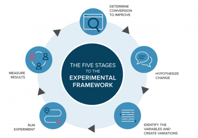
Image Source: https://www.optimizely.com/ab-testing/
The above image is from Optimizely, an application I used to use at my tutoring company Student-Tutor for testing elements on our website.
You can also use the built-in split testing functionality of platforms like LeadPages or Click Funnels.
Summing It All Up
Here’s what we covered:
- Landing Page Defined (generally)
- Landing Page Defined (specifically)
- Click-Throughs
- Lead Captures
- Sales Pages
- Tools to Build Landing Pages
- Some more Q&A advice for building landing pages
- Who is your target audience?
- What is the audience’s problem, pain point, or deep motivation?
- What essential info needs to be communicated about your offer?
- Final tip: use language directly from your clients’ mouths.
- Landing Page Optimization (basics)
- How do you want to optimize? (SEO, UX, Conversions)
- Visuals (colors, fonts, images)
- Colors, fonts, and images need to match where traffic came from.
- Image selection needs to enhance, have no-brainer clarity, and evoke emotion where applicable)
- Fonts need to be clean and clear.
- Spacing (how does layout make you FEEL – gut reaction?)
- Landing Page Optimization (advanced)
- Headlines
- The 5-Second Rule
- A/B Split Testing
As you can see, this is a meaty and important topic!
I could talk about it for days! 😉 But for now, I hope that this was a solid overview for you to get going (or improving) with your landing page creation and optimization.
The Next Steps
• What new ideas sparked for you?
• What will you test first? Tell me @LaptopLaura
You must be logged in to post a comment.